
Reply To:
Name - Reply Comment
Last Updated : 2024-04-26 12:28:00
18 July 2016 09:46 am - 0 - {{hitsCtrl.values.hits}}

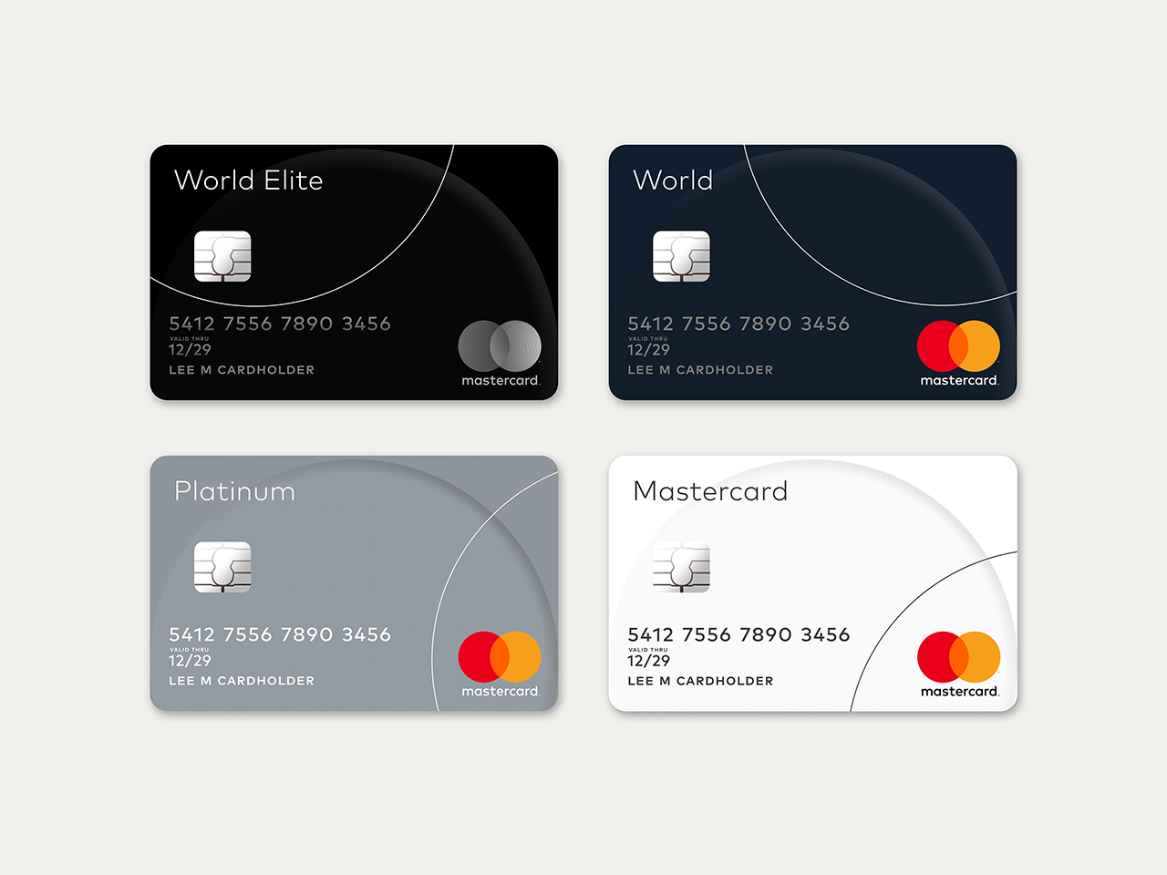 Mastercard redesigns its iconic logo for the digital age, as it’s familiar orange and red circles
just got a facelift.
The credit card company rolled out a minimalist new logo on Thursday — its first redesign in
twenty years. The new brand identity is created by design firm Pentagram, the new look will
roll out in the fall in conjunction with a new secure digital payment system, Masterpass.
Instead of interlocking in the middle as they previously did in the old one, the two circles now
blend into one another in a design that looks exactly like a Venn diagram.

In the old logo, the word MasterCard was rendered inside the interlocking circles. In the new
logo, the word is outside the circles. This change makes the mark more flexible - it easily
can be placed horizontally or vertically.Pentagram In the old logo, the letters M and C were capitalized; in the new one, all the letters are lowercase. The result is a visual aesthetic to the contemporary world.Pentagram This change fits with what seems to be the prevailing style in corporate logo design right now — simple onedimensional shapes, minimalist and seriffree basic fonts that translate better in digital formats. Verizon and Google have all moved in the same direction in the past year. The new logo is also meant to mark the company's move into online payment platforms and evolving financial services tech.

Add comment
Comments will be edited (grammar, spelling and slang) and authorized at the discretion of Daily Mirror online. The website also has the right not to publish selected comments.
Reply To:
Name - Reply Comment

US authorities are currently reviewing the manifest of every cargo aboard MV

On March 26, a couple arriving from Thailand was arrested with 88 live animal

According to villagers from Naula-Moragolla out of 105 families 80 can afford

Is the situation in Sri Lanka so grim that locals harbour hope that they coul